- Ana Cvetković

- Jul 6
- 14 min read
Updated: Jul 13

Trends come and go faster than ever these days, and it can be tough to keep up. Web design is no exception—what’s fresh today might feel outdated tomorrow. That’s why Wix created an internal Trend Library. This resource helps our designers stay updated on the latest trends, making sure our templates and design strategies are always a step ahead.
To help you stay ahead in this ever-changing landscape, we’re bringing you insights from Trend Library content strategist Michelle Klein. For every modern website design trend we explore, we’ll highlight a Wix user who’s nailed it. These examples aren’t just great designs—they’re packed with inspiration to fuel your own projects. Stick with us to learn how to make a website that stands out in today’s trends..
Ready to venture into modern website design? Wix’s website builder has just about all the tools you need.


TL;DR: modern website design examples
These modern website designs reflect the thoughtful trends shaping 2025—clean layouts, subtle animations and smart design choices to inspire your next project.
Web design trend | What it brings to your website |
|---|---|
Clean, minimal layout | Keeps things clear, calm and focused for your visitors |
Bold typography | Makes your message stand out with personality and impact |
Responsive design | Looks great on every screen—from phones to desktops |
Micro-interactions | Adds little moments of delight that guide and engage |
Consistent color palette | Builds trust and brand recognition through cohesive color choices |
Custom visuals & 3D elements | Brings depth and uniqueness to your layout with modern graphics |
Sticky nav & smart menus | Makes it easy to explore without getting lost |
Interactive storytelling | Turns scrolling into an experience with design that tells a story |
Background or hero video | Instantly captures attention and adds movement that tells your story visually |
12 modern website design examples
Below you’ll find 13 modern website design examples with aspects that you should consider incorporating into your digital design language. Each example is a live site created on Wix.
01. Mango Marketing: dopamine-boosting colors

Give your website visitors a dopamine fix with an explosive website color scheme. While dopamine-boosting color palettes consisting of bold colors have made their way from the runways to our closets, they’re also making a splash on the web.
Take inspiration from Mango Marketing, a digital marketing agency with a website that’s drenched in a vibrant orange. From the firm’s logo to the image in the hero fold, just about every element on the site features this cheerful color, which is reminiscent of the agency’s namesake fruit.
Give your site visitors a boost with this colorful canned drink store website template.


02. Cami Ferreol: elegance in motion

Cami Ferreol's website is a bold, vibrant example of modern web design that perfectly reflects her identity as a graphic designer, visual storyteller and strategist. The homepage instantly grabs attention with its playful intro: “I am Cami and I am:” followed by rotating words like “designer,” “strategist” and “creative.” It’s a fun, interactive way to highlight her many talents.
The site’s design uses bold color blocks in bright, lively hues, giving it an energetic vibe while keeping everything organized and easy to navigate. Subtle animations and high-quality visuals flow seamlessly throughout with animated images in the projects section adding a creative, interactive touch.
The typography is modern and bold. The clean layout paired with dynamic elements and visuals creates a fun yet professional experience.


Tip: Make your services pop with 3D design elements
Let’s say you’re making a website for a marketing agency. Instead of illustrating your services with photographs or two-dimensional icons like every other marketing firm, use three-dimensional-appearing icons to make your website stand out. You could find an icon of a 3D camera to represent your photography services or a 3D pencil for your copywriting services.
If you’re interested in adding a 3D moving element, use Wix’s transparent video tool to add this type of motion to your site. If you don’t have the time or skills to design 3D graphics, find some in Wix’s Media Manager or commission them from a graphic designer.
Give your online business some dimensionality with this gaming company website template.
03. ZHOOSH: dynamic animation

Website and branding agency ZHOOSH has crafted a homepage bursting with personality and movement. Color-shifting buttons, subtle animations and engaging interactions all work together to invite exploration.
From the bold tagline to seamless transitions, every element reflects ZHOOSH’s commitment to creativity and innovation. The design strikes a perfect balance with strong typography and thoughtful animations offering a fresh, modern take on web design.


Web animation can transform your website, adding interactivity and engaging visitors as they click, scroll, or hover. Movement naturally draws the eye, helping you build an attention-grabbing website. Here are some creative ways to make the most of animations:
Hover effects: Add subtle touches like color or size changes to buttons, images or text when hovered.
Parallax scrolling: Create a sense of depth by making background images move slower than the content in the foreground.
Scroll animations: Animate elements into view as users scroll down your page.
Entrance effects: Use animations like slide, fade or zoom to introduce elements as your page loads.
All of these features are available in the Wix Editor, making it easy to take your site to the next level. Just remember to use animations thoughtfully to keep your site running smoothly.
Take advantage of this marketing webinar website template’s dynamic animation.
04. DA Creative: tomorrow-world aesthetics

DA Creative Design's website is a sleek and modern representation of a no-limits branding agency based in New York City. The colorful, chromatic spinning elements in the website header and footer evoke futuristic, sci-fi shapes that hint at the agency’s forward-thinking approach to their work. Thin ellipses on the page look like Saturn’s rings and add to the space-age feel of the website.
The layout keeps things simple and clear. A monochromatic color scheme combined with bold typography gives it a clean modern feel while high-quality visuals and mockups bring it to life.
Right from the homepage, scrolling text animations grab attention, highlighting services like branding, web design, video editing and social media strategy. It's all about creating a sleek professional vibe that feels fresh.


Use this marketing webinar modern website design template to give your site a tomorrow-world twist.
05. Daniel Aristizabal: organized chaos

Art director Daniel Aristizabal’s website is a joyful homage to rule-breaking. It features three animations that simultaneously vie for your attention, playfully disregarding the standard rule of visual hierarchy. Elements seemingly overlap and compete, creating a dynamic, lively experience.
The static image positioned above the fold in the top right corner accentuates this approach, floating independently—almost as if it's an afterthought, challenging the norm of deliberate placement and balance. This design not only captures attention but also celebrates the freedom and creativity now flourishing in modern web design.


To truly craft a modern website, it's time to let go of conventional design principles and embrace a more expressive approach. Michelle advocates for a bold departure from the neatly organized layouts of the past, suggesting we lean into the inherent messiness of human nature and its imperfections.
“We’ve made a true departure from neat organization, embracing real human nature and its many flaws,” she says. “This mess has a positive effect, liberating designers from old norms of art direction and allowing for freer expression.”
With this fashion designer website template, you can make your online home a site to see.
06. Dopple Press: retro vibes

Retro vibes are front-and-center on printing studio Dopple Press’s website. A playful, anthropomorphic theme carries from the man-in-the-moon-like menu icon to the pink mascot to the animated printer below the fold. This website also features funky 60s and 70s design elements, like peace signs, chunky fonts and amorphous blobs. “1930s-inspired cartoon elements are back in style, adding a nostalgic, playful and human-like quality to inanimate objects,” notes Michelle.
The site is even home to a throwback from the days of Clippy, the Word assistant. On Microsoft Word, you could click on Clippy to get help. Dopple’s website pays homage to Clippy by instructing visitors to click the paper clip icon to request assistance. Clicking on the icon launches the visitor’s email service.


Sometimes modern website design is all about what’s new. Other times, it borrows from the past. “Design has followed current events in its reverse direction,” says Michelle. “The 70s, 90s and 2000s will continue to provide uplifting inspiration, while the rebellious 80s and a darker medieval period will grow in popularity.”
Michelle recommends experimenting with VHS video styles, medieval fonts, grunge motifs and pixelation. These low-resolution elements and effects remind us of simpler times. “Until now a visual element to be avoided, pixelation is gaining popularity in images, fonts and even clothing,” says Michelle. “Fueled by internet nostalgia and inspired by AI tools and the metaverse, it reflects a deliberately low-tech aesthetic amid a rapidly progressing digital world.”
This fintech webinar modern website design template offers the nostalgic vibe you’re itching for.
07. AST & Partners: dark mode

AST & Partners’s website is easy on the eyes, literally and figuratively. The design agency built its online home on a black background with white text. Dark mode helps colorful visual elements come alive in the foreground and keeps the focus on the portfolio text.
Dark mode, now common on smartphones, browsers, and websites, pairs dark backgrounds with light text for a sleek look and practical benefits:
Reduced eye strain: Less bright light makes screens easier on the eyes, especially in low-light settings, reducing eye fatigue.
Energy efficiency: Saves power on OLED/AMOLED devices, potentially extending battery life.
Content focus: Dark backgrounds make text, images, and multimedia pop.
Accessibility: Improves readability for users with visual impairments or light sensitivity.


Step over to the dark side with this product landing page website template.
08. Sharon Radisch: modular grids

Depending on the effect that you want to create, grids can either create unity or hierarchy among website elements. Artist Sharon Radisch achieves both by using a uniform grid on her portfolio site; the grid highlights her specialities as an artist (spanning industries like fashion and still life, jewelry and more) without overemphasizing one industry over another. However, Sharon uses pops of color to draw visitors’ eyes to particular blocks.
While many web design trends come and go, grids are a staple of modern website design. Their longevity is a testament to the enduring power of structured layouts in the digital age.
That being said, Michelle has noticed a slight variation on grids that has emerged on the scene: modular grids. Modular grids divide a page into uniformly sized boxes, which creates an organized structure for arranging content.


“Breaking up sites into Bento Box-like sections impacts everything in the design, from the grid and layout to the visual language and colors,” she says. “This method is neatly organized with minimal spacing in between, but also incorporates playful elements like slightly rounded corners and refreshing color combinations.”
Get your business on the grid with this wedding planner modern website design template.
09. Tiff Cruz: expressive typography

While a picture is worth a thousand words, sometimes you want website visitors to focus on just a few words. Bold, expressive typography is popping up all over the web, according to Michelle.
When you land on Tiff Cruz’s website, you can’t help but notice her name, which stands out in a large, funky, cream-colored serif font against a stark black background. This design makes her name unforgettable, reinforcing her personal brand.


“Designers are going bigger than ever before, with over-the-top, XXL titles that often take over a third of the screen,” says Michelle. “In a world where attention is fleeting, these titles make it impossible for us to look away.”
Incorporate this trend by welcoming visitors with a large, showy website header that leaves an impression. This trick is particularly useful on business websites that are more informational and lack visual elements.
Eager to try this big trend? Give this home goods website template a spin.
10. Kode With Klossy: edgy navigation

Check out supermodel-founded coding program Kode With Klossy’s inventive menu for modern website design inspiration. Clicking the pink and green bars on the top left of the website triggers a chartreuse-colored menu to roll in and take up the whole screen. The two bars twist until they turn into an “X,” which you can use to close the menu.
This full-screen menu focuses your attention on where to go next. Each option is labeled and accompanied by a unique icon. When you hover over an icon, the icon turns a dark green that matches the background of the homepage. This interactivity supports the navigational experience by highlighting where visitors are about to go next.


Your website’s navigation menus need to be intuitive so visitors can easily get from one page to the next. But just because navigation is practical doesn’t mean it can’t also be beautiful.
Modern websites call for edgy, interesting navigation. Think beyond utility when designing a website—without sacrificing it—and make your menus and website footers captivating design features.
Try out Wix’s mega menu feature or use the lightbox element to create a full screen pop-up menu.
11. Noah Demeuldre - homepage video

Noah Demeuldre’s website takes a bold approach by making video the star of the show. Each project kicks off with high-quality video previews in slick, full-screen layouts that instantly draw you in. The motion adds energy and emotion, making every piece feel alive. By leaning into video, the site nails modern design trends, using dynamic content to grab attention and keep you hooked.
Did you know people remember 95% of a message when they see it in a video compared to just 10% when reading? Adding a homepage video can make your website not only more memorable but also way more engaging.
Homepage videos create an instant connection, set the tone for your site and add a modern, polished look that grabs attention and keeps visitors hooked.
Ready to flex your directing chops? Wix Video Maker makes video production accessible.


Say hello to scrollytelling—a design trend that turns basic scrolling into an interactive story. Add movement to your site and transform the way visitors experience your content. Try these scrolling effects with the Wix Editor:
Parallax scrolling: The background shifts as you scroll.
Scroll-triggered animations: Animations pop up as you scroll, while everything else stays still.
Horizontal scrolling: The page moves sideways instead of up and down.
Long scrolling: A single page scrolls for an extended period.
Infinite scrolling: The page loops back to the top for endless exploration.
Get moving with this creative director modern website design template, which is chock full of scroll effects.
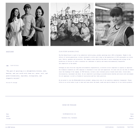
12. The New Denim Project: austerity

Textile company The New Denim Project’s website is a masterpiece of minimalist web design. The site embraces the white in white space by placing ample room between each section and using white to provide a visual respite for visitors and make denim-colored elements stand out.
Functionality and minimalistic aesthetics are the name of the game when it comes to this element of modern website design. With fewer distractions, the most relevant elements stand out on a clean, simplistic website, making them easier for visitors to find.
This style embraces negative space (more commonly known as white space) to put the content front and center, making sure the main message doesn’t get lost. Austerity can also be a nice reprieve for viewers who are so often bombarded by visuals.


Another way to implement austerity on your website is to embrace classic symmetrical website layouts. Symmetry ensures that your content is broken up in a clean and organized structure. Experiment with the following layouts for a modern website design:
Card-based layouts: This layout displays images and other content in bite-sized rectangles, making it ideal for portfolio websites. Slightly resembling a collage, this layout is simple to navigate and stays consistent across screens.
Split-screen layouts: This interface layout divides the homepage into two or more vertical parts, creating a quick navigation experience when one half of the page is dedicated to the menu and the other half to primary content.
Make this austere branding portfolio website template your own.
What makes a modern website design
Modern website design is a balance of form and function—clear, fast and visually compelling. It focuses on user experience while staying current with evolving tech and aesthetic trends. Below are the key elements that define this style today, along with why they matter.
Minimalist layouts with purpose
Minimalism in web design isn’t about stripping everything away—it’s about focusing on clarity and usability. By cutting out distractions and reducing visual clutter, minimalist designs make it easier for users to navigate and find what they need.
Clean layouts highlight what matters most, like a product or important message, without overwhelming the viewer. This approach also boosts page speed, helping lower bounce rates and improve search rankings. Thoughtful use of white space gives content room to breathe, creating a sense of elegance and focus.
Bold, expressive typography
Modern websites rely on typography to share information and connect with users on a deeper level. Bold, high-contrast headlines instantly grab attention, while smart font pairings bring personality and structure. A luxury brand might choose elegant serif fonts for a sophisticated edge, while a startup could opt for sleek sans-serifs to keep things modern and fresh.
Typographic hierarchy, like varying font sizes and weights, guides users seamlessly through content without overloading the design. Accessible, readable text across all devices ensures a better experience for everyone, including those with visual impairments.
Subtle animations and microinteractions
Web animations are a game-changer for user experience, adding clarity and a touch of delight to interactions. A simple microinteraction—like a form input shaking when left blank or a heart icon pulsing after a click—lets users know their actions are registered. It cuts down on confusion and keeps them engaged.
Scroll-triggered animations, on the other hand, guide attention to specific sections and create a natural flow, turning content into a more dynamic experience. When used thoughtfully, these subtle movements make a site feel polished, professional and more enjoyable to explore.
Mobile-first and responsive design
Mobile-first design ensures that your content loads quickly, fits naturally within a user’s thumb zone and eliminates unnecessary clutter that might overwhelm a phone interface.
Responsive design makes sure your website looks great and works smoothly on any device—phones, tablets, laptops, or big monitors. It adapts automatically, so users get the best experience without lifting a finger. Plus, mobile-friendly pages rank higher in search engines and boost conversions.
Performance and accessibility built-in
If your website takes more than three seconds to load, you could lose a big chunk of your visitors. Simple fixes like compressing images, deferring scripts and using modern frameworks like Next.js or Astro can make a huge difference.
But speed isn’t everything. Your site also needs to work for everyone. That means designing with screen readers in mind, ensuring color contrast for better readability, using semantic HTML for smooth navigation and testing keyboard functionality.
Branded visuals and media
Modern websites rely on custom visuals—original photos, illustrations and short videos—to strengthen brand identity and keep users engaged. By moving away from generic stock images, brands create media that fits their color palette, tone and layout, building recognition and making every page feel intentional and trustworthy.
Today’s visuals are also built for speed. Designers use lightweight formats like WebP, SVG and Lottie paired with lazy loading and responsive sizing to keep load times fast on any device. Motion adds a thoughtful touch, with hover effects, scroll-triggered animations and interactive elements bringing depth without pulling focus from the content.
Scannable content structure
Most people don’t read websites word-for-word—they scan. That’s why modern web design focuses on breaking content into easy-to-read sections with clear headings, short paragraphs, bullet points and visual cues. Smart use of typography, spacing and alignment creates a natural flow, helping users find what they’re looking for quickly.
Today’s websites rely on bold headlines, quotes, icons and content cards to make scanning easy. This makes the experience better for visitors and helps search engines and AI tools understand your content so it ranks higher.
Sticky and simplified navigation
Modern websites often feature sticky headers that stay visible as you scroll, keeping pages or actions within easy reach. Progress-aware navigation is also gaining traction, highlighting the current section or shrinking headers to free up space.
Thoughtful use of hamburger menus, slide-out panels and mega menus—especially on mobile—helps simplify the user experience. The goal is to reduce friction: fewer menu items, clearer labels and smoother transitions.
Personalized and dynamic content
Instead of showing the same static content to everyone, modern sites adapt based on location, behavior, time, or user preferences. Think of an ecommerce homepage that highlights products you recently browsed or a SaaS site that changes its headline depending on where you came from.
This kind of personalization makes content more relevant, reduces user effort and boosts engagement. With tools like headless CMS platforms, user data tracking and AI, creating dynamic content is easier than ever.

Modern website design examples FAQ
What is modern website design?
Modern website design combines visual clarity with smooth functionality. It favors clean layouts, bold typography, intuitive navigation and responsive structure. The focus is on both form and performance—design that looks good and works fast.
Why should I look at modern website design examples?
Examples are a shortcut to inspiration and clarity. They show what’s possible visually—and what actually works—based on real brands and businesses. Studying them helps you avoid clichés and apply trends in a way that fits your goals.
What industries use modern web design?
Every industry can benefit from modern design—from tech and fashion to law firms and nonprofits. Clean visuals, mobile-first design and intuitive UX aren’t style choices—they’re competitive necessities. It’s less about what you do, and more about how clearly you present it.
How can I make my website look modern?
Start with simplicity: limit your color palette, use generous white space and choose readable fonts. Then add subtle animation, sharp images and a layout that adapts smoothly to any screen. Tools like Wix’s AI website builder can help you do all this in minutes.
What does an outdated website look like?
Outdated websites often have cluttered layouts, tiny fonts, slow load times and awkward mobile views. Flashy banners, low-res images and inconsistent design scream “stuck in the past.” They can make even a great product or service feel untrustworthy.


Comments