- Paul Boag

- Jul 10
- 6 min read
Updated: Jul 15

Let me guess. You started your business to do what you love, not to fuss over website tweaks. I get it. Most days, your to-do list is long enough without worrying about conversion rates or button colors.
Still, after looking at hundreds of small business sites, I keep seeing the same simple mistakes that quietly chase away customers. The good news? Most of these are easy fixes. You don’t need a tech degree or a pile of spare time. Just a few practical changes.
Let’s chat about eight common website slip-ups I see all the time, and how you can start turning more visitors into loyal customers today.
Learn how to create a website or build yours with Wix’s website builder today.
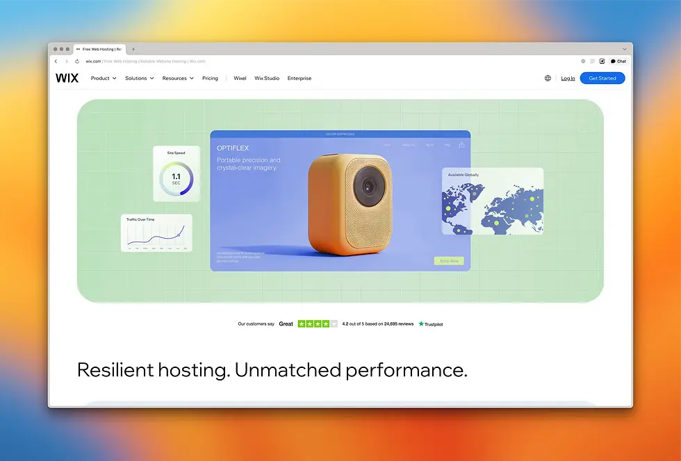
01. Poor site performance
Your website’s speed has a direct impact on how many visitors stick around. Recent research shows that even a single second of delay in website load time can reduce conversions by as much as 7%. More than half of mobile users abandon a site if it takes longer than three seconds to load, and 63% of all visitors will leave if a page exceeds four seconds. Sites that load in five seconds have conversion rates that were up to three times lower than those loading in just one second.
Slow servers, large unoptimized images and bloated plugins all contribute to sluggish pages. I also find that small business sites are often built on outdated hosting platforms or cheap budget plans, which add to the problem.
To combat these issues, start by running a speed test with tools like Google PageSpeed Insights. Identify the biggest bottlenecks (like images or scripts) and optimize or remove them.
Consider web hosting with a platform built for performance, like Wix, which can make all the difference. Wix automatically applies global CDN, image compression and caching to keep your site running smoothly. That means visitors get fast loading across devices without extra configurations on your part.
Finally, a word of warning: Web design trends are great for keeping your site feeling fresh and current, but be careful they don't impact performance. Trends like large animations or auto-play videos can slow things down if not used carefully. This article on web design trends is a good place to spot both what’s popular and what to approach with caution.
02. A failure to address user concerns
Your visitors arrive with questions and doubts. This is triggered by a variety of psychological factors, ranging from an animal instinct to look for danger, to choice paralysis, and even a fear of missing out. Not answering them leaves people guessing, and guessing rarely leads to a sale. Common objections include price, return policy, installation times and customer support availability.
I’ve seen product pages that hide shipping details or leave out warranty information entirely. That lack of transparency erodes trust. To fix this, build an FAQ section or incorporate answers directly into your product descriptions. For example, after outlining features, add a simple heading like “Questions you might have” and list three to five bullet points with clear answers.
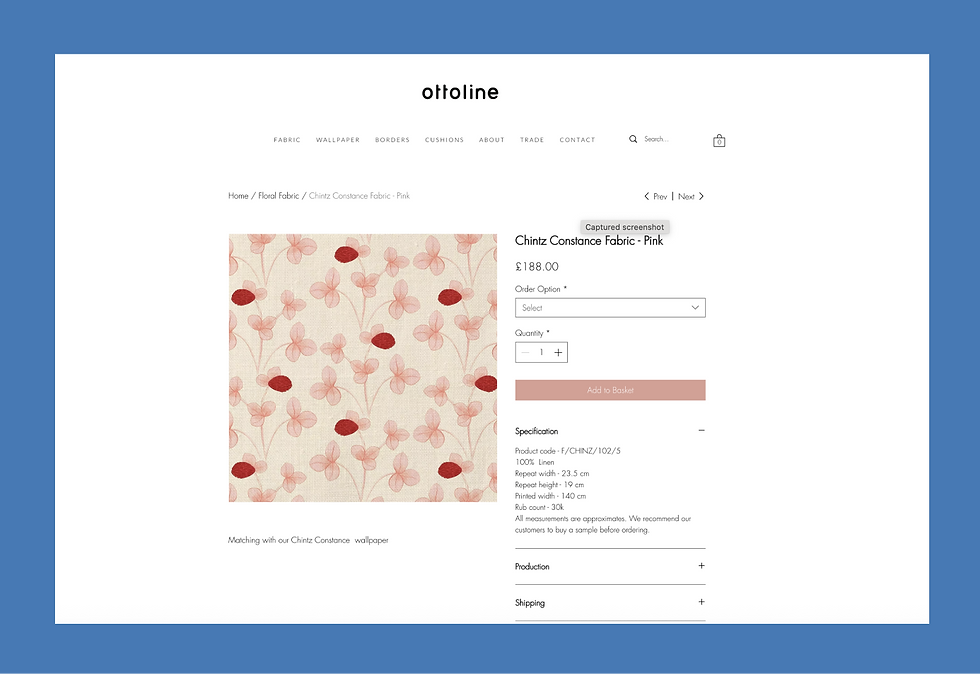
Note how Ottoline, a fabric and wallpaper design company, addresses common user questions and objections directly on their product pages.
03. Too difficult to read
Most people skim web content rather than reading every word. Long, dense paragraphs and complex language put readers off. I’ve seen sites where walls of text bury the main message.
Keep your language simple. Write at roughly a ninth-grade reading level by breaking paragraphs after two to three sentences, or using clear headings and bullet lists to guide the eye. For example, instead of:
Our team of seasoned professionals leverages a bespoke methodology to deliver transformative digital solutions.
Try:
We help you build websites that work. Our proven process guides you from idea to live site in four clear steps.
That change alone makes your message easier to digest. And that means more people actually read it.
If you’re planning a full overhaul, remember the advice in this step‑by‑step guide on how to design a website, which says:
While having plenty of material on your website is great, remember to always put quality over quantity. In an era of decreasing attention spans, the best way to catch your visitors’ attention is to showcase only your best content.
If you want more help with writing and layout, this article on web design tips for small businesses is packed with practical suggestions.
04. Distracting imagery and video
Visuals can be your best friend or your worst enemy. A beautiful photo or a short demo video can convey trust, show off products and set the right mood. But oversized image files, auto-playing videos or generic stock photos can distract from—and even slow down—your site.
As another example, video backgrounds might look impressive, but they can destroy performance and distract a user while they attempt to read text on the page. These factors undermine conversion. So, you’ll want to bear these tips in mind:
When you choose visuals for your website, ask yourself, “Does this help tell my story?” If the answer is no, it might just be decorative clutter.
Optimize image sizes before upload. Consider using modern formats like WebP. If you must use video, keep it short, on mute by default and host it on a platform that supports lazy loading.
A well-placed product photo gallery or a quick ‘how it works’ clip can boost engagement without overwhelming your visitor. Done right, media adds authenticity and clarity.
For more examples of what works well, the article on the science of first impressions in web design is worth a read.
05. Conflicting calls to action
Every page on your site has a goal: to get visitors to take a specific action. But if you give too many options, you risk analysis paralysis.
Too often pages will have three or more buttons competing for attention; each button has its own CTA, like “book a call,” “download a PDF” and “sign up for the newsletter.” The visitor ends up paralyzed by the choice and unsure of which is right for them.
Focus on one primary CTA per page. Make it large, clear and action-oriented—like “Get your free quote.” Secondary actions, like “Learn more,” should be smaller and placed below the main option. That hierarchy guides your visitor’s eye and clarifies the next step.
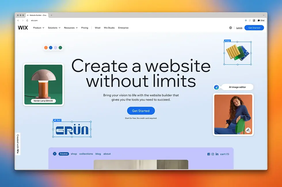
Notice how the Wix website focuses all attention on a single clear CTA—“Get Started.”
Consistency helps too. Use the same button style and phrase across your site for similar actions. That builds familiarity and reduces friction.
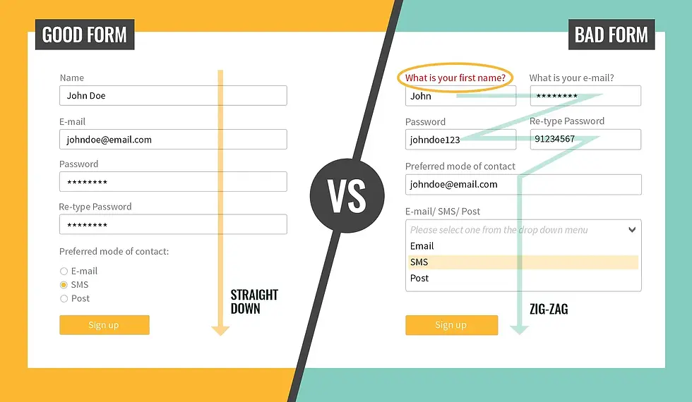
06. Overly complicated forms
Forms are one of the last hurdles before conversion. Yet, I often see forms with unclear labels, too many fields and non-descriptive error messages. These issues frustrate users and derail sign-ups.
Start by auditing your forms. Ask yourself what information you really need. If you can follow up later via email or phone, skip those fields for now. Limit forms to three to five fields whenever possible.
Label fields clearly. Instead of “Name,” try “Full name as it appears on your credit card.” And test your error handling. When someone enters an invalid email, the message should explain exactly what’s wrong, not just “Error.”
Keep forms mobile-friendly. Enable autocomplete and ensure fields stack vertically. The easier it is to fill out, the more completions you’ll see.
07. No targeted landing pages
Running ads without matching landing pages is like fishing without bait. Sending all traffic to your homepage wastes momentum. The more landing pages you use, the higher your conversion rates tend to be because each landing page can be customized to the ad, audience or specific offering.
In fact, companies that grow their total number of landing pages from 10 to15 see a 55% increase in leads according to HubSpot.
Each campaign deserves its own landing page tailored to the ad’s message and audience. That means matching headlines, images and offers. You cut down on distractions and keep your visitor focused.
Platforms like Wix make spinning up new pages fast. You can clone an existing page, tweak text and images, and go live in minutes—no coding required.
08. Not iterating post-launch
Your website isn’t a brochure. It’s a tool you shape over time. Unfortunately, all too often business owners treat their site like a checklist item. Once it’s live, they move on.
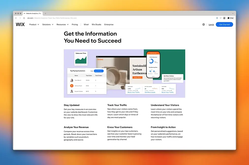
But the best sites evolve. Use analytics tools (such as Wix Analytics or Google Analytics) to monitor performance. Look at metrics like bounce rate, page time and goal completions.
Identify underperforming pages and run simple A/B tests on headlines, images or button colors.
Small tweaks add up. Even changing a button label from “Submit” to “Get My Info” can increase clicks.
For example, I once saw a 6% increase in checkout completions by replacing a Verisign logo, which confirms that a site is secure, with a message telling users the same thing using text and an image of a padlock. Turns out users just didn’t understand what a Verisign logo meant.
I would therefore recommend scheduling a monthly review to track changes and plan your next round of tests.
The wide range of Wix website features includes built-in tools for testing and analysis, no separate plugins needed.


Comments