- Allison Ko
- Jun 24
- 9 min read

Updated: Jul 28

A good template goes a long way when you’re creating a website. It saves you hours of trying to turn a rough idea into something that actually works on a screen.
But apart from giving you an idea to work with, the best website templates offer something even more valuable: a peek into the mind of a professional web designer. They’re built on careful research and years spent honing an eye for websites that don’t just look great, but convert.
At Wix, our designers are the masterminds behind the 2,000+ website templates we offer. We asked them, “Which Wix templates are your favorite and why?” Below are their top picks, with their tips on how to get the most out of them.
01. AI Company Website

Best qualities: Modern, ample room for content
Best for: Tech, Sciences, Crypto
View the template: AI Company Website
For those in the tech or sciences field, this template—appropriately titled “AI Company Website”—features a futuristic design. The subtle animations and high-contrast color scheme give it a sleek, sophisticated edge.
“It has a good scrolling rhythm,” says designer Kobi Michaeli. “Just like the rhythm in music, rhythm in web design is important for drawing people in and moving them through the page in a smooth, cohesive way.”
He points out how the contrasting background colors break up monotony. How, even though the template is largely black and white, you can feel the artistic expression. “You’re creating a colorful experience, just with black and white.”
Kobi’s advice: “This design is a good source of inspiration. So, even if you’re not running a tech company, it can give you ideas of how to create a contemporary site. I once saw a guy who designs surfboards use this template as a reference; it inspired him to incorporate really cool 3D renderings of his boards and a visual timeline on his site. His site ended up looking very impressive.”
02. App Launch

Best qualities: Fluid one-pager, blends classic and modern styles
Best for: Mobile apps, product launches
View the template: App Launch
Singled out by several designers, this website layout puts a fresh spin on a traditional app landing page. With its soft pastel colors and classic serif font, it’s what Kobi calls “an unexpected combination that works well together and creates a unique design.”
But more importantly, it’s versatile. “I really tried to create something that would work for anyone—not just someone in fitness,” says Mika Heymann, the designer behind the template. “All the sections are highly editable…and I tried to use fun colors that work for different industries, but still ties in with the typography to create a cohesive brand.”
Mika’s advice: “You’ll notice that multiple sections of the page are designed to spotlight your app interface, starting with the main header and continuing through to the ‘Explore the app’ section. It’s all ready to go—you just need to plug in your own images, video or text.”
Learn more: How to choose a website template on Wix
03. Massage Therapy Clinic (Classic)

Best qualities: Strong, breathable structure; cohesive branding
Best for: Health and wellness, beauty
View the template: Massage Therapy Clinic (Classic)
A website often works best when it feels like an extension of the physical space it represents. This layout pulls it off. Using a two-tone color palette, it exudes the calming atmosphere of a spa.
“There's something very soothing throughout the scrolling experience,” says Mika, taking note of the full-screen images, parallax effect and white space. She also points out the colored overlay on the pictures, which gives the photos a uniform, sun-kissed look. “This effect makes all the pictures look like they’re from the same photoshoot, even if they aren’t.”
Mika’s advice: “When you’re working with a structure like this, image curation is key. Use some photos that are taken from afar, and others that are a bit more zoomed in. Or, switch it up between photos of a product versus a service.”
04. Bread Shop (Modern)

Best qualities: Contemporary composition that’s easy to edit, versatile icons
Best for: Bakery, restaurant, service businesses
View the template: Bread Shop (Modern)
Another team favorite: this bread shop layout blends all the right elements for a deliciously smooth experience.
“I really gravitate towards grids that I can understand,” says designer Sapir Ziv. “For example, this template uses a 50/50 split screen that’s maintained throughout the site. I also like the use of cards that make it clear where content should go.”
There are dedicated spots for text, alongside dedicated areas for images, making the template “a good shape-shifter for other industries,” says Sapir.
“I like that this design uses abstract icons that aren’t entirely bakery-related,” adds Mika. “That’s more of a visual decision than a content decision. It works visually with the content, but isn’t attached to a bakery. So, if you're a clothing brand, you can still use this template and these icons as-is.”
Sapir’s advice: “When you’re working with split grids, upload images in pairs. Use two images that contrast each other, but have some kind of ‘through line.’ For example, they could share the same color palette or textures. Or, you could pair a close-up image with a wide-angled shot, an abstract shot with a more traditional one.”
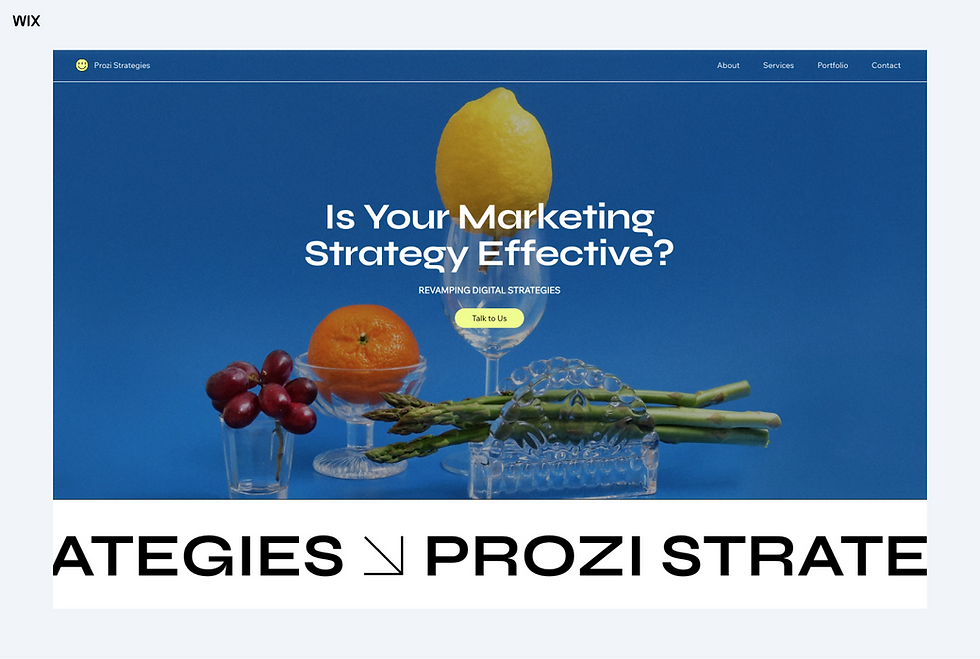
05. Digital Marketing Agency (Vibrant)

Best qualities: Interactive, text-based, highly customizable
Best for: Digital services, personal portfolio, tech
View the template: Digital Marketing Agency (Vibrant)
This template reminds us that sometimes, the simplest websites are the most striking. Despite its lack of imagery and limited color range, the design feels fresh and experimental.
Sapir highlights the text marquee and 3D mouse animation, which give it an interactive edge. “It makes you feel like you're a part of the site—and it’s a really good way to engage users.”
Perhaps more importantly, you can simply swap out any element to suit your brand. “If the mouse animation feels too avant garde, you can easily replace it with an image to make it look like a classic ‘welcome’ section,” suggests Sapir. The website can be as text-heavy or as image-heavy as you want.
Sapir’s advice: “This layout features a bento-style grid; it’s modular so you can create different arrangements and everything still fits in place. In other words, it’s versatile. You could, for example, merge two columns and make them into one cell if more space is needed. Or, you could change the colors and thickness of the lines to drastically change the look and feel, without changing anything about the layout itself.”
06. Digital Marketing Consultant

Best qualities: Visually stimulating without relying too much on imagery
Best for: Digital products, service businesses
View the template: Digital Marketing Consultant
There’s a certain charm in templates that blend classic design elements with modern flair. Take this template as an example. “It feels fresh—like analog meets digital,” points out Sapir.
“It's a combination of two different aesthetics,” explains designer Yan Imbrik, who created the layout. “The first aesthetic is more human, less AI-ish. The second aesthetic—which is reflected in the typography—is a bit more editorial, like a newspaper.”
He notes that the layout utilizes preset animations offered in Wix, including parallax and shutter-like scroll effects, to create a more visually rich experience. Farther down the page, you even get a full-screen decorative animation, “which is a nice breath between information,” comments Sapir.
“It doesn't feel overwhelming in terms of the amount of data that is on the site,” she elaborates. “It’s a really great site, whether you're trying to present a product or something that needs more structure.”
Yan’s advice: “You’ll notice that certain animations and details, like the dots and dashes, are repeated in the design language. You can adjust either of these for your brand, but make sure to keep it consistent throughout. Test different combinations and stick with the one that feels intuitive.”
07. Child Therapy (Playful)
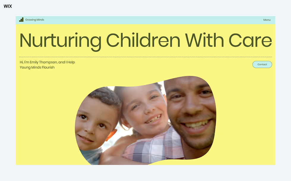
Best qualities: Kid-friendly, energetic
Best for: Children’s brands, education, gaming, yoga, dessert shops
View the template: Child Therapy (Playful)
If you’re going for a fun, playful vibe with your branding, this template may hit all the right notes. “It’s giving cute, friendly and optimistic,” says graphic designer Gayane Gasparyan. The jellybean-like shape mask framing the video at the top of the page adds a playful energy.
As you scroll down, you’ll also see 3D animations (“those are technically transparent videos,” Gayane points out). These could be used as-is or swapped out for other transparent videos or elements, such as icons from the Wix Gallery.
The color palette, font choice and rounded buttons all contribute to the kid-friendly experience. “Ask yourself, who’s in your audience?” recommends Gayane. “If it’s mostly kids or young adults, these types of design choices help.”
Gayane’s advice: “You could also modify this template for a more ‘serious’ industry or brand. Just swap out the 3D graphics with icons that are better suited for your brand, and try sharper corners or more serif fonts.”
08. Digital Marketing (Sleek)
Best qualities: Dynamic, yet simple one-page layout
Best for: Service businesses, personal portfolio
View the template: Digital Marketing (Sleek)
Here’s an example of a classic layout kicked up a notch. The first fold is sleek and unassuming. But as you scroll down, you’re quickly met with a big, bold text marquee and poppy sections.
“It looks professional and fresh because of the choice of colors and typography,” says Gayane. “Most of the color comes from the images, while the rest of the site sticks to black and white—except for pops of neon yellow-green that give it a modern kick.”
She adds, “This template uses soft animations. See the parallax scrolling and subtle hover effects? The animation isn’t overpowering and gives the website a modern twist.”
While the template focuses on one long continuous page, held together by a site menu and anchors that drop you to the right sections, it can easily be expanded. You can add more internal pages and link to them via the main menu or "Read More" buttons. “It’s dynamic like that,” says Gayane.
Gayane’s advice: “You could swap the hero image with a video. If you do that, make sure to consider how the text marquee looks together with the video—does it look too busy? Usually I’d say it’s too much, so you might want to move the text marquee down a few sections, so there’s more separation between two moving elements.”
09. Skincare Products Company

Best qualities: Clean, dynamic (lots of movement throughout)
Best for: Beauty, wellness, healthcare
View the template: Skincare Products Company
There’s a sense of serenity that comes with this template, which uses a unique glass effect and scroll animations to breathe life into an otherwise simple webpage.
“It’s nice to feel that your scroll controls the page,” says Gayane. “And the animations get users to pay attention to things they’d normally scroll past, like the special offer at the bottom of the page.”
She notes that there’s a difference between soft and bold animations. That latter is better suited for industries like tech or fitness, where the branding is typically louder and associated with movement. Meanwhile, for industries like skincare or even education, softer animations (like the one in this template) feel more natural, adding to a light, airy atmosphere.
Gayane’s advice: “When you’re using animation, think about the overall flow of the page. It’s possible to have too much animation that ends up distracting the user or making things harder to read. I’d recommend just adding animation to one element—or a series of elements—in a section at a time. And use certain animations consistently throughout the page.”
10. Health Care Landing Page

Best qualities: Professional, yet welcoming design
Best for: Health and wellness, education, fitness
View the template: Health Care Landing Page
In healthcare, people need to feel like they’re in good hands. This template is designed to reflect that.
“The colors and the photographs are warm and welcoming,” notes designer Ben Chervinski, “while the typography is more professional. The idea is that if you’re offering a healthcare service, you need to prove that you’re reliable and trustworthy.”
As you scroll through the page, you’ll notice a nice balance of real imagery versus icons, serif fonts versus sans-serif fonts. You’ll spot floating images and a floating menu, alongside a consistent theme of rounded shapes—all of which contribute to the warmth of the site.
“Notice the pill-shaped buttons, which give the page a distinctive look that could work for various industries,” adds Ben.“When you make a template, you need it to be versatile. Just by changing the colors or photos, this template could fit a completely different business, without losing its unique vibe.”
Ben’s advice: “If you’re working on a one-pager like this, everything needs to breathe. Simple details, like the ‘floating’ movement of the photos, can help the page flow. It can prevent the page from being long and boring. That being said, this template could easily be turned into a full-blown website; you just need to add more inner pages through the Wix Editor.”
Read also: Multi-page website vs. one-page website
11. Art Gallery

Best qualities: Non-traditional composition, image-based
Best for: Photography, art, personal portfolio, blog, eCommerce
View the template: Art Gallery
This template oozes creativity, even with its minimalistic design. Just like in a real art gallery, the website leads you down various corridors of art, alternating between two-column, asymmetric layouts and more classic, symmetrical grids.
“The photos make the website here. If the photographs are good, you're good,” says Ben, observing how this template doesn't rely on motion, 3D graphics or any other decorative styles. It simply features images with text.
“There isn't anything complicated in the content, but the layout is a bit more on the professional side. It’s quite sophisticated. Everything is floating, but still organized. It has a high-end vibe, but is still straightforward.”
Ben’s advice: “Little changes go a long way. This template is meant to give you structure and a professional vibe. By only changing a few things, like the photos and text, you can end up with a really professional-looking site. And if you want to use it for a more fun, personal blog, but the fonts that we use here seem a bit too serious, you can change the font in a few clicks and make it yours.”
Related reading:


Comments